CFRC Mobile Radio App for Android and Usability Research Study


I have to say, it was quite the experience dealing with a client on such a personal level (they were right on campus). But in order to create the application, there were a few steps we had to go through first.
Research
The main task which was faced when determining the design of the application had to deal with how the user interface is able to integrate all the various features in a simple, easy to use, visually appealing manner.
To generate ideas for possible solutions to this problem, the team took to researching design solutions that had been used by other companies developing similar applications. Sampling other Android based radio streaming applications enabled the team to get a feel for the advantages and disadvantages of various methods to organize all the necessary features. Through this research, it was determined that there were realistically three design solutions which could be feasible in the scope of this project.

The simplest solution would be the listing of features in a formation similar to that shown by the CBC Music application. This would provide easy to find links to all the available features the application would provide, which would then appear on a separate page which would require the use of a “back” button to return the user to the main screen. Figure 1 also demonstrates a possible layout for the page which would outline the program the customer is listening to as well as providing a simple play/pause interface, and space for popup advertisements.
The CBC Music application shows how the Android guidelines of a modern, bright, simple interface could be easily incorporated into a list design.


These three applications show that there are many successful methods to build a radio streaming application that need to be considered by the team before carrying on with development.

Evaluation
Seeing as we wanted to objectively - well, as objectively as we could given the subjective nature - find which design worked best for us, we made an evaluation matrix. We assigned a value from 1-5 for each individual quality of the application design under the categories: Intuitiveness, Simplicity, Appeal, Orginization of Content, and Spatial Arrangement
Method of Organization of Features
|
Intuitiveness
|
Design Simplicity
|
Visual Appeal
|
Organization
|
Spatial Arrangement
|
Listed
|
4
It is easy to find the links to different features from the home screen, but without any visual cues, which features each listed link leads the user to are left up to interpretation of the wording.
|
4
The list option would utilise the least amount of content, and thus would be the least cluttered.
|
3
Very sleek and modern, but overall bland design.
|
3
Everything is categorized through the main page, but in doing so there may be too many options at once, making it difficult to find which feature the user desires.
|
4
With many links placed in a small space with a scroll ability, the list option is effective in managing space to make available for additional features such as advertisements
|
Tabbed
|
5
Along with some simple icons, the tabs are descriptive improvements on the list method. With a similar design to internet browsers, the layout is user friendly
|
2
Along with the tabs, listed content or features would be visible on the same screen. If a media bar or advertisements were added, the page would be very cluttered
|
4
The icons add flavour to this design which mimics tabbed folders
|
5
Breaks down features into broader categories and makes it easy for the user to switch between tabs and features. Can also contain listed content.
|
2
The space taken up by the tabs on every page of the application takes up valuable space and gives the application a crowded look
|
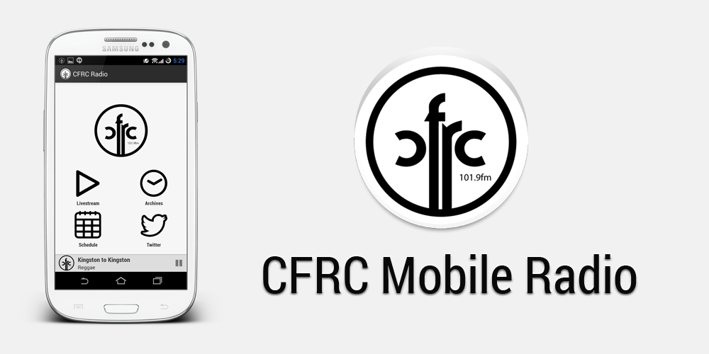
Categorized Buttons
|
5
The large buttons with simple icons and a short description are easy to understand and use. Their size means that any user can access the features and is not overwhelmed by other details.
|
4
Very minimalistic design with minimal amount of links and clutter with adaptability for added features
|
5
Modern and chic, these large buttons fill the screen with bright colours without clutter. The icons are practical and visually appealing.
|
4
Using broad categories to contain all features, it is easy to find content as long as the description of the categories is accurate
|
4
The buttons take up a large space on the main screen but these sizes can be adjustable to suit additional features like advertisements. As well the space used is a clean design.
|
It was quick to see that the Slacker Radio app had more positives in our situation. The design was very intuitive with its large buttons, and the minimalist design matched our goals. In addition, it was modern (a must for Android development). While it was not as organized as the tabbed interface, it was still well laid out and easy enough to use. Finally, the button design was scalable and could work well on devices of many sizes. This was important, as we were developing for all Android phones, not just one.
Implementation
Within our application, there were a few design choices we had to make, such as placement of UI elements (such as buttons, icons, etc.), placement of content (such as the calendar for the broadcasting schedule). While doing this, we had to take into consideration the range of motion of the user’s thumb when using the application. As this is an Android device and the most popular Android devices have a 4.2 inch screen or above, we based our work off of the assumption that the standard device would be the Galaxy Nexus – Google’s recommended developer phone. Keeping this phone in mind, we made created an image (Figure 7) to examine the range of motion exhibited by the average user’s thumb.

Keeping this in mind, the UI was designed to include most interactive content within this human-defined boundary. For example, the main screen was designed with all of the main icons on the bottom half of the screen. This was done in order to allow easy interaction with most UI elements presented to the user.
In addition, the CFRC logo is prominently placed throughout the application. This allows the application to create a strong mental connection with the CFRC radio station itself, rather than just the application they are using.
Conclusion
Good design takes time. You need to analyze the pros and cons of many decisions. Does the design of the app concede too much to functionality? Then it may be ugly. Or does functionality lose out over design? Then it may not be useful to most. You have to strike a happy medium.
Good design isn't just about colors or shapes, either. You must take into account the way in which the user is going to access your work. Does it make sense to place an often used control at the top of the screen, out of reach of the user? No. But where it is placed must make sense within the design itself.
Good design takes time. So take it.


Comments
Post a Comment